This is my project. I am so proud of it and absolutely love the concept me and my partner made up. For a first project, I love what we were able to create with minimal experience. I hope you enjoy. You're welcome and thank you!
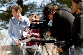
There are a few things that are necessary to take into consideration when planning for a short film; plot, resources, actors, and sound. The fundamental thing to perfect is the plot as that is what our short film relies on. More importantly, a realistic plot. It is impossible to make a film with 13 plot twists, diving into all genres, and focussing on a wide array of characters. Instead of being overambitious, as teens tend to be, filmers should focus on one conflict, a few characters, and not add any extra action than there needs to be. A nice idea to keep in mind is to not overdo it or under do it. With short films, there’s about 5 to 15 minutes to make magic on the screen. This time should be utilized in giving audiences a well thought out, cohesive plot. Resources are just as important as plot and are often a major decision factor. As high school students we don’t have access to CGI, special effects, pyronetics, or in...
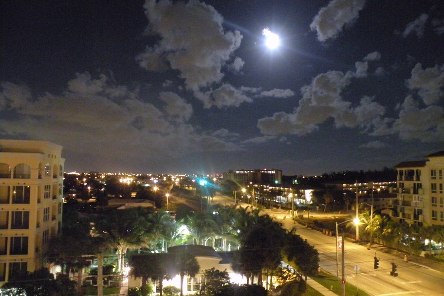
We chose Mary ’s house to film because of the surrounding location. For scene 2 it would be better to film it on the street that the house is on because it is eerily wide with no markings and we want that unsettling feeling to the scene. It would also make sense for a murder to happen on an abandoned looking road th an a nice one with traffic. The road next to Elena’s house isn’t as wide , is very brightly lit, and has a lot of car traffic. Mary ’s backyard is also on a canal, therefore has a clear view of the horizon, whereas Elena’s apartment complex does not. We need this horizon view for the last scene’s pan down. It then makes sense to do the inside filming in the house to keep it all in one spot. Since the opening scene takes place at sun down, we will have to make sure that the lighting is dark. One way we will do this is by doing all of the filming after 6:00 p.m. to ensure that the sky, if not completely dark by th...
I believe that the most important concept to a film's success is its film score. Without music to properly capture the suspense, excitement, and mood of the story, audiences would never resonate with the emotions of the film. For our film, we wanted the last 30 seconds to include a powerful music score. The music would take place after the two detectives wrestle on the ground and highlight the mystery of who shot who. As the camera pans up at the tress, I wanted a song that captures the peacefulness of the treetops while still being a little mysterious. As the camera pans up to reveal that Detective Reynolds survives, the screen will cut black and the credits will be shown as the music still plays. The music should be able to show the audiences shock and resolution with the plot. Searching for music is harder than talking about it. I knew that there was no way of getting a popular song with royalties in our film. Because of this, I started to look...

Comments
Post a Comment