Hello! This is my creative critical reflection. I had fun making it and thinking into dept about the thought process and production of the project. Enjoy!
There are a few things that are necessary to take into consideration when planning for a short film; plot, resources, actors, and sound. The fundamental thing to perfect is the plot as that is what our short film relies on. More importantly, a realistic plot. It is impossible to make a film with 13 plot twists, diving into all genres, and focussing on a wide array of characters. Instead of being overambitious, as teens tend to be, filmers should focus on one conflict, a few characters, and not add any extra action than there needs to be. A nice idea to keep in mind is to not overdo it or under do it. With short films, there’s about 5 to 15 minutes to make magic on the screen. This time should be utilized in giving audiences a well thought out, cohesive plot. Resources are just as important as plot and are often a major decision factor. As high school students we don’t have access to CGI, special effects, pyronetics, or in...
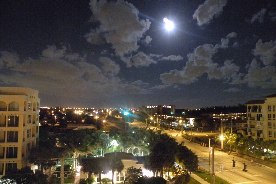
We chose Mary ’s house to film because of the surrounding location. For scene 2 it would be better to film it on the street that the house is on because it is eerily wide with no markings and we want that unsettling feeling to the scene. It would also make sense for a murder to happen on an abandoned looking road th an a nice one with traffic. The road next to Elena’s house isn’t as wide , is very brightly lit, and has a lot of car traffic. Mary ’s backyard is also on a canal, therefore has a clear view of the horizon, whereas Elena’s apartment complex does not. We need this horizon view for the last scene’s pan down. It then makes sense to do the inside filming in the house to keep it all in one spot. Since the opening scene takes place at sun down, we will have to make sure that the lighting is dark. One way we will do this is by doing all of the filming after 6:00 p.m. to ensure that the sky, if not completely dark by th...
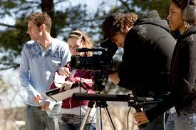
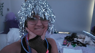
On Wednesday October 15, I started to film with my partner. We did all filming at her house due to the hallway and LED lights she has. She also said she had a disco ball we planned to use but ended up not. I brought props such as my wig, glow sticks, glasses, beads, and a costume change. I played the futuristic music character and she played the character listening to music. I utilized my phone to play the song Light Switch by Charlie Puth while filming as we needed to stay on beat while dancing. My phone has trouble downloading music , so I ended up downloading a 3-minute Tik Tok of that song , c ropping it down , and playing that while filming . My partner got her friend to help us film scenes where we both had to be in. We needed an actual person, not just a tripod because for some scenes the camera had to move at angles. After explaining to the friend how to shoot certain scenes and hold the camera, I started to direct one of the hall...
Comments
Post a Comment